I love graphic novels. I tried to pen one before, but wasn’t successful at figuring out which panels to do. I’m leaving that one to experts. But every now and then, I think adding a few illustrations to a book can be fun, for the writer as well as the reader.
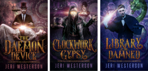
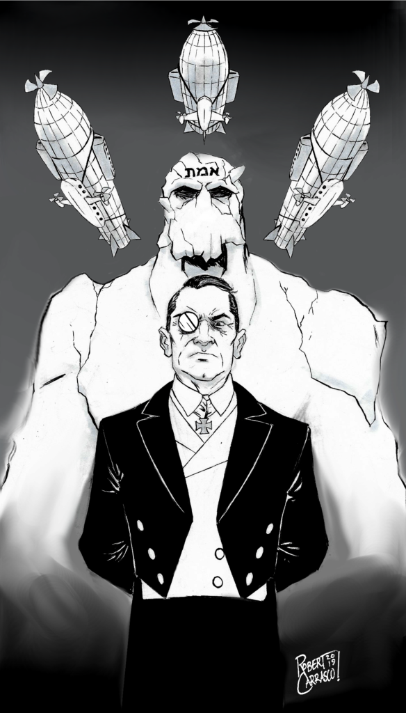
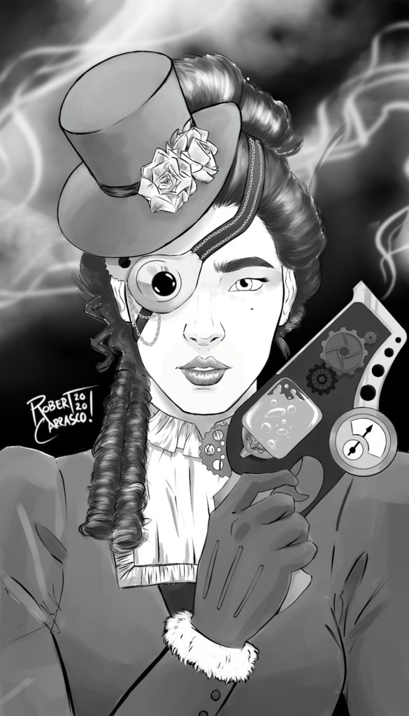
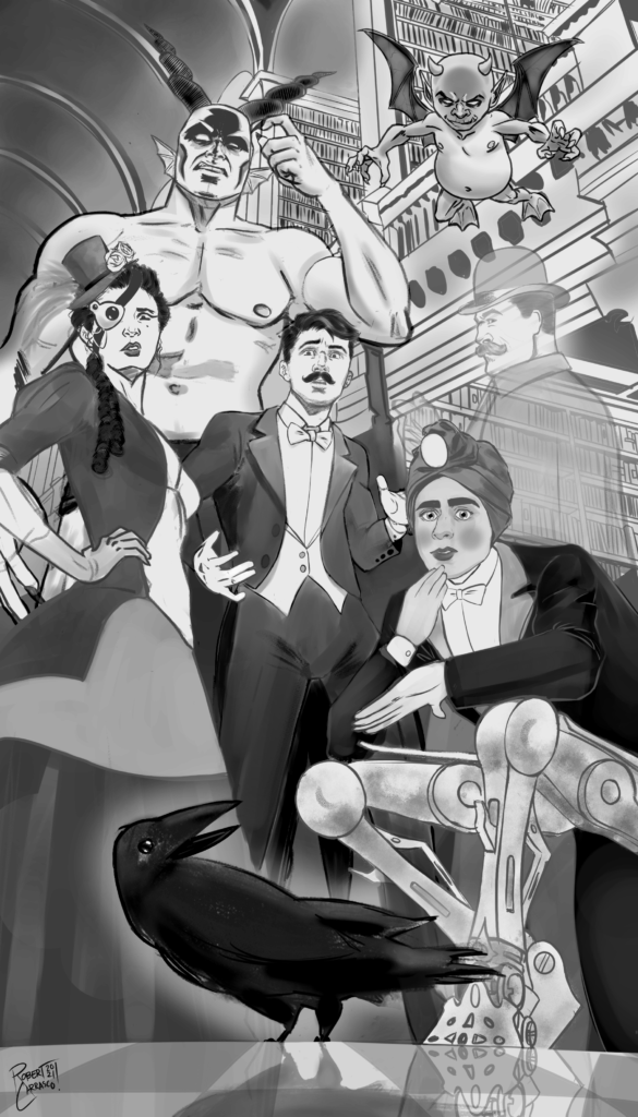
The first time I did this was with my gaslamp-steampunk series the Enchanter Chronicles Trilogy. This really would have been great as a graphic novel, but it was going to take too much time and too much money to hire someone to…well, be a partner with me by illustrating it all. So I hired a young fellow, Robert Carrasco (brother to my son’s writing buddy), who was becoming a whiz at comic book illustration. Here’s a few below that were included in the books.
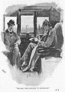
But what I wanted for my An Irregular Detective Mystery series, was something more to the timeframe of the story, something Sidney Paget-like, or line drawings as you might see in the newspapers of the day. I tried to hire someone, but she didn’t want to draw to the style I specified, even though she specialized in line drawings. Huh. Kids today! Some of you may know that I was a graphic artist and art director back in the day before computer graphics. As an art director, you hired illustrators. I’d rough out (by hand and by using photos for reference material) and collage it together by Xeroxing it. Yes, this was high tech back in the 1980s) and give it to the illustrator to clean it up with their own expertise. If you wanted a specific style, you’d ask them to do it and they would. Not today, I guess. So I thought I’d give it a go by doing my own. If it worked, I’d save money. If it didn’t, it was back to the internet.
First, I had to go to the art store and get familiar again with all the old names that I used to use; Caslon art paper, Speedball pen and nibs, India ink, Staedtler erasers, and a mechanical pencil. I was going to use for reference Sidney Paget where he used water color rather than just black and white ink drawings to illustrate the Sherlock Holmes tales for the Strand Magazine.
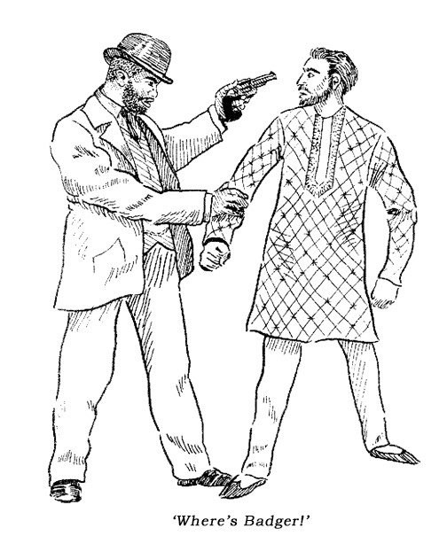
But really, I was going more for the style of Charles Dana Gibson‘s line-only drawings. You know him, don’t you? He created the Gibson Girl, the late 19th century/early 20th century type of rich, spoiled, and arch girls with bountiful hair and lowered lids where it appeared that they couldn’t possibly care less what the latest handsome man wanted of her. I had been obsessed with his art since high school, even wrote a report on him and drew my own samples of the artwork of his style.
But I knew I wasn’t a greatly accomplished illustrator and had concentrated my talents on GRAPHIC DESIGN, which is designing logos and brochures, catalogues, lots of videocassette boxes, posters, etc. And yes, even book covers. When I really needed an illustration, I hired someone. Being a professional myself, one often worked with other professionals (and I tell newbie authors that. Never design your own covers unless you are an artist, and hire at the very least a copy editor for proofreading).
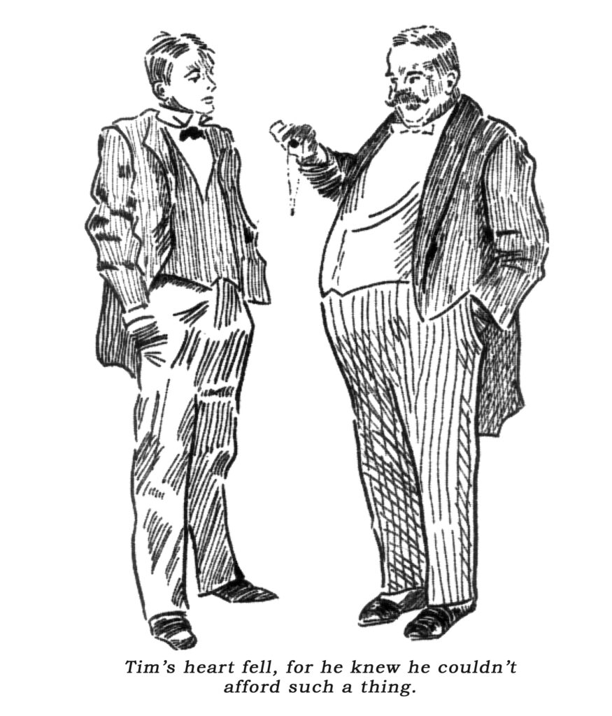
So, I fell into the old techniques and added a few high tech ones. I got some stock photos for reference, and used some Sidney Paget and Gibson drawings also for reference and to trace (being public domain), collaged them together (often taking a head from a photo and putting it on the body of an illustration), scanned them, traced that with pen and ink on art paper taped to my lightboard, scanned them again into the computer for Photoshop touching-up and aging with a filter, and…voila! Oh, there was a LOT of re-drawing again and again, abandoning images and trying new ones, but finally came away with something I like. I hope you like them too. They will be appearing in the latest release coming December 1, 2026, in THE MAGICIAN’S MISADVENTURE, and in future releases. Below are a few samples.
Discover more from Jeri Westerson
Subscribe to get the latest posts sent to your email.